
Hey there, fellow design enthusiasts! Let’s talk about something that often gets overlooked but can make or break your design—typography. Yep, the art of selecting and arranging fonts is crucial, and today we’re diving into why it matters and how to nail it in your next project.
Why Typography is a Big Deal
Imagine reading a beautifully written story with a terrible font. Painful, right? Typography is like the voice of your text; it sets the tone, conveys the mood, and can even influence how your audience feels. Whether you’re designing a website, a poster, or even a business card, the right font can make your content more engaging and readable.
The Basics: Font Categories
First, let’s break down the main categories of fonts:
1. Serif: Think Times New Roman. These fonts have little “feet” at the ends of letters and are great for printed materials because they guide the eye from one letter to the next.

2. Sans-serif: Fonts like Arial or Helvetica. No feet here! These fonts are clean, modern, and perfect for digital screens.
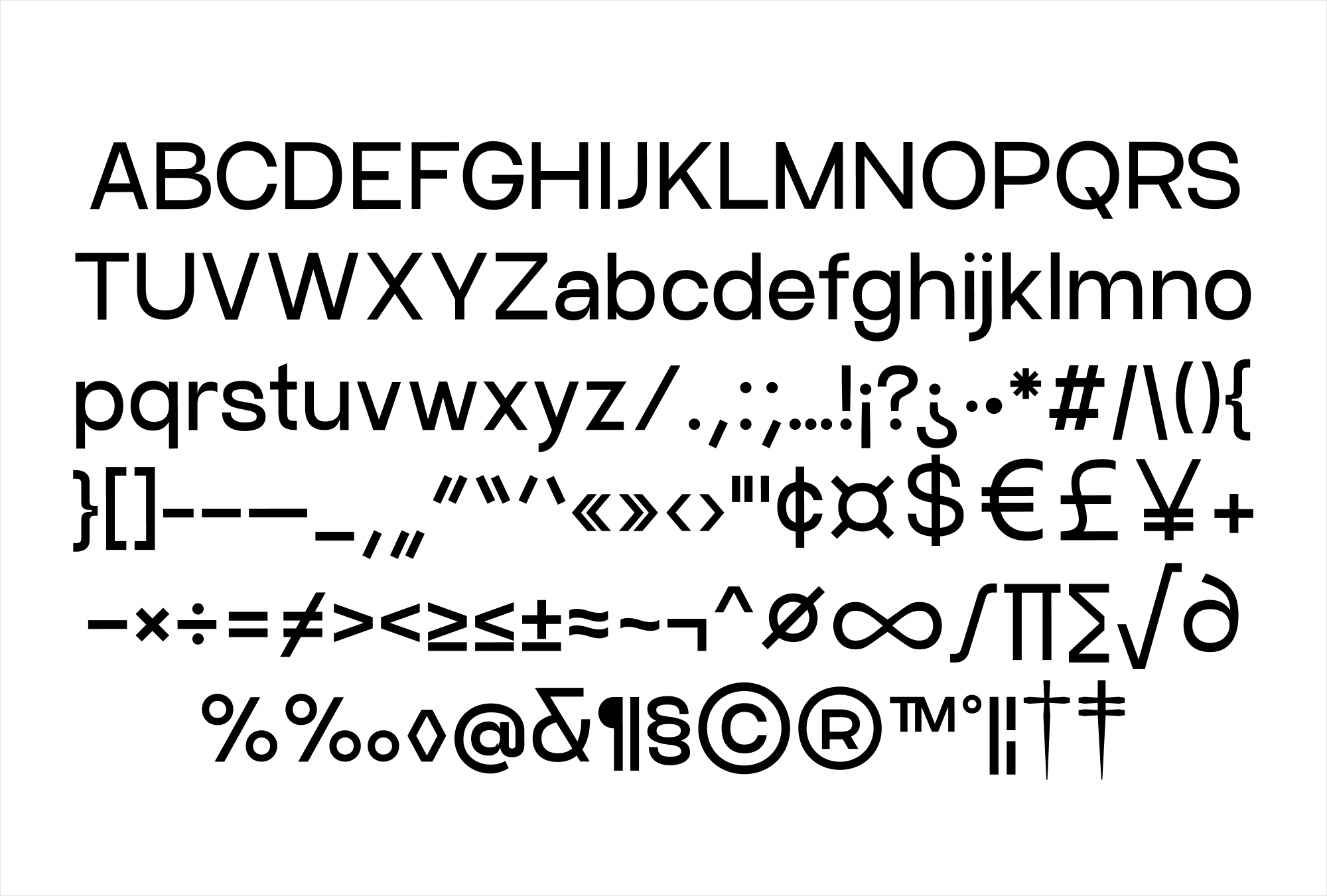
3. Script: These mimic cursive handwriting and add a touch of elegance. Use them sparingly for invitations or logos.
4. Display: Bold, fun, and unique, display fonts are meant to stand out. They’re perfect for headlines or anything you want to grab attention.

Pairing Fonts Like a Pro
Pairing fonts effectively can elevate your design from good to outstanding. Let’s delve deeper into each point to understand how to master the art of font pairing
Contrast is Key
The principle of contrast applies not only to colors and shapes but also to fonts. When pairing fonts, opt for a serif font with a sans-serif font, or a script font with a sans-serif font. This contrast creates visual interest and helps differentiate between different types of text in your design. For example, pair the classic elegance of Zvon Serif with the modern simplicity of Craftwork Sans for a balanced and harmonious look.
Limit Your Choices
While it can be tempting to experiment with multiple fonts, using too many can overwhelm your design. Stick to two or three fonts at most—one for headings, another for subheadings, and a third for body text if necessary. This approach maintains coherence and readability throughout your design, preventing it from looking cluttered or disjointed.
Match the Mood
Consider the tone and purpose of your design project when selecting fonts. The mood created by your font choices should align with the message you want to convey. For instance, a playful script font might be perfect for a birthday party invitation but inappropriate for a serious business report. Always choose fonts that reinforce the intended mood and enhance the overall theme of your project.
Tools of the Trade
Choosing the right fonts is easier with the help of specialized tools and resources
1. Google Fonts
A vast collection of free, high-quality fonts that are easy to integrate into web projects.
![]()
2. Adobe Fonts
Offers a wide selection of fonts for desktop and web use, with options to sync fonts directly to Adobe Creative Cloud applications.
3. Font Squirrel
Provides free fonts that are licensed for commercial use, making it a valuable resource for designers on a budget.
4. MyFonts and Creative Market
These platforms offer premium fonts that can add a unique touch to your designs. They often feature fonts with intricate details and specialized styles that stand out.

Common Mistakes to Avoid
Even the best designers can make typography blunders. Here are a few to watch out for:
Ignoring Readability
No matter how aesthetically pleasing a font may be, readability should always be a priority. Avoid overly ornate or decorative fonts that sacrifice legibility. Test your font choices across different devices and screen sizes to ensure they remain clear and readable in various contexts.
Using Too Many Fonts
Limiting the number of fonts in your design maintains visual consistency and coherence. Stick to a cohesive font palette to establish hierarchy and guide the reader’s eye through your content. Reserve decorative or display fonts for headlines and sparingly use them for emphasis.
Bad Kerning
Kerning refers to the spacing between characters in a font. Poorly adjusted kerning can make text look uneven or difficult to read. Most design software tools provide options to adjust kerning manually or automatically. Take the time to fine-tune kerning settings to achieve balanced and visually pleasing typography.
Get Inspired!
Before you start your next project, take some time to look at designs you admire. Pay attention to their typography choices. Sites like Curated Design, Pinterest and Behance are great for finding inspiration. Notice how the fonts complement the overall design and how they make you feel.
Typography might seem like a small detail, but it’s a powerhouse in the design world. The right fonts can elevate your project, making it more professional, readable, and visually appealing. So next time you’re working on a design, give typography the attention it deserves.
Happy designing, guys!