Best UI Kits for Startups
Craftwork
03 February 2026

7 mins to read
Early-stage teams rarely have time for custom interface design. Best UI kits for startups offer pre-built component libraries that let you move from idea to clickable prototype in days, not weeks. This collection focuses on Figma resources that actually ship—dashboard components, mobile patterns, and landing page elements that work together without requiring a dedicated design team.
In this article
Craftwork Newsletter
Get the latest news, tutorials, resources, tools, and new product releases directly to your inbox every week.
Log in with your Craftwork account first and claim your gifts on the newsletter page.
Subscribing our newsletter you agree to our Terms of Use and Privacy Policy.
When a UI Kit Makes Sense — and When It Doesn't
Component libraries work best when you need to move fast with limited design resources: launching an MVP, testing a new feature direction, or building internal tools where custom design isn't worth the investment.
They work less well when brand differentiation is critical, when you need highly specialized interactions, or when your product will eventually require a fully custom design system anyway. In those cases, a kit can become technical debt rather than a shortcut.
Honest limitations to consider:
- Pre-built components may look generic without customization effort
- Not every kit scales well as products grow more complex
- Some teams outgrow their starter kit within 6-12 months
If speed matters more than uniqueness right now, a solid component library can save weeks of foundational work.
Top UI Kits
Dashboard Kits for SaaS Products

SaaS and data products need comprehensive dashboard components: charts, tables, filters, navigation, and data visualization patterns. A solid analytics-focused kit includes everything for building admin interfaces—KPI cards, data tables, sidebar navigation, user settings. These resources emphasize information density, clear hierarchy, and responsive layouts that work across desktop and tablet contexts.
Best for: SaaS platforms, analytics tools, B2B applications.
Mobile App Component Libraries
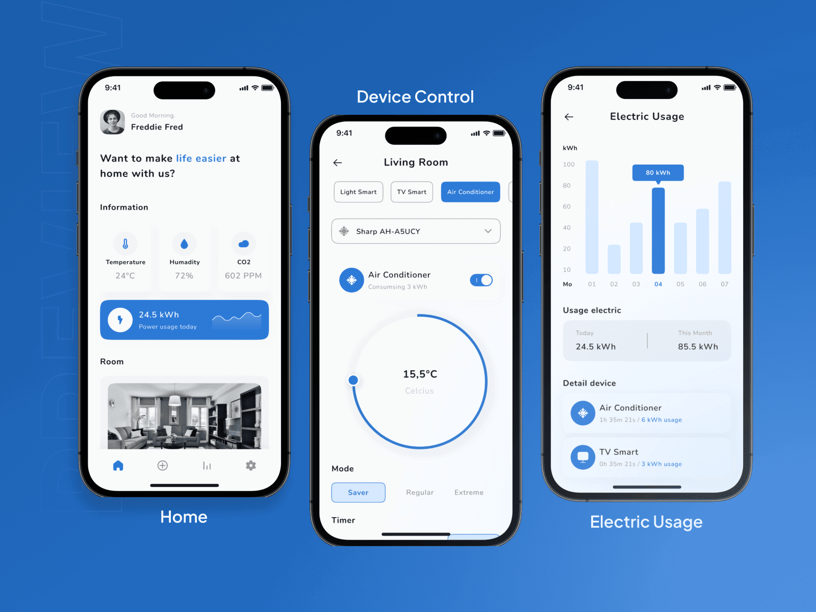
Mobile-first products benefit from components optimized for small screens and touch interactions. These libraries provide iOS and Android patterns, navigation elements, form components, and gesture-based interactions designed specifically for phones. They follow platform guidelines while maintaining brand consistency, reducing the need to build separate designs for each OS.
Best for: Consumer apps, mobile-first tools, social products.
Landing Page Design Systems

Marketing sites require different components than product interfaces: hero sections, feature grids, pricing tables, testimonial layouts. Landing-focused resources emphasize conversion-optimized layouts, clear typography hierarchy, and visual flow that guides visitors toward CTAs. They help teams launch marketing pages quickly without sacrificing performance.
Best for: SaaS marketing sites, product launches, startup websites.
E-commerce Interface Kits

Online stores need specialized components: product grids, cart flows, checkout sequences, product detail pages. E-commerce kits provide conversion-focused patterns for product discovery, comparison, and purchase. They emphasize trust signals, clear pricing, and streamlined checkout flows that reduce abandonment.
Best for: Online stores, marketplaces, subscription products.
Minimal Foundations for Custom Brands

Some teams prefer minimalist foundations that provide structure without strong aesthetic opinions. These kits offer basic components—typography, buttons, forms, spacing—that you can customize extensively. They work well for brands with distinct visual identities or products that need highly differentiated interfaces.
Best for: Design-forward brands, products with unique requirements, teams with strong design capabilities.
Getting the Most Out of Your Kit
Start with an inventory
Before choosing anything, list what components your product actually needs. Core screens, required elements, technical constraints. This prevents over-investing in kits with unnecessary complexity—or under-investing in ones that lack critical pieces. Be specific about data visualization needs, form requirements, and navigation patterns.
Customize what matters, leave the rest
Component libraries provide starting points, not finished products. Change what matters for brand differentiation—colors, typography, spacing—while leaving proven patterns intact. Resist the urge to modify interaction patterns unless there's clear user value. Standardized behaviors feel familiar and reduce friction.
Watch for component drift
As products evolve, teams often add custom components that don't match the original kit. This breaks visual consistency and increases maintenance overhead. Document component usage, create clear guidelines for when to build custom versus use existing, and maintain design system discipline even when moving fast.
Think about where you'll be in 12 months
Consider how kits scale as products add features and complexity. A good kit includes enough variety to support different contexts while maintaining cohesion. Ensure it can handle new screen types, data patterns, and user flows without requiring complete overhauls. Good investments grow with products rather than becoming constraints.
There's no single perfect choice for every team. The right component library depends on your product type, technical stack, and how much customization you're willing to do. As your product evolves, you can come back, compare options, and pick whatever matches your current stage.
Read more
Explore all