Empty State Illustrations: Examples and Use Cases
Craftwork
06 October 2026

5 mins to read
Empty state illustrations work best when they support a clear explanation of what happened and what the user can do next. A new account with no projects needs a different message from a search with no matches or a service error. This guide separates those situations, gives example interface copy, and compares three illustration packs from the Craftwork catalog. The illustrations are starting points for the visual treatment; the state and action should come from your product.
In this article
Craftwork Newsletter
Get the latest news, tutorials, resources, tools, and new product releases directly to your inbox every week.
Log in with your Craftwork account first and claim your gifts on the newsletter page.
Subscribing our newsletter you agree to our Terms of Use and Privacy Policy.
First use: help someone create the first item
A first-use screen should explain what belongs there and offer a direct starting action. For a project workspace, an example is “Your projects will appear here” with “Create a project.” If importing is also supported, make it a secondary option rather than sending everyone to a generic help page.
Use an illustration that leaves space for that message and action. It should not look like an error or suggest that content has been lost. The exact words and button labels here are examples to adapt to an existing product flow.
Empty State UX Illustration Set
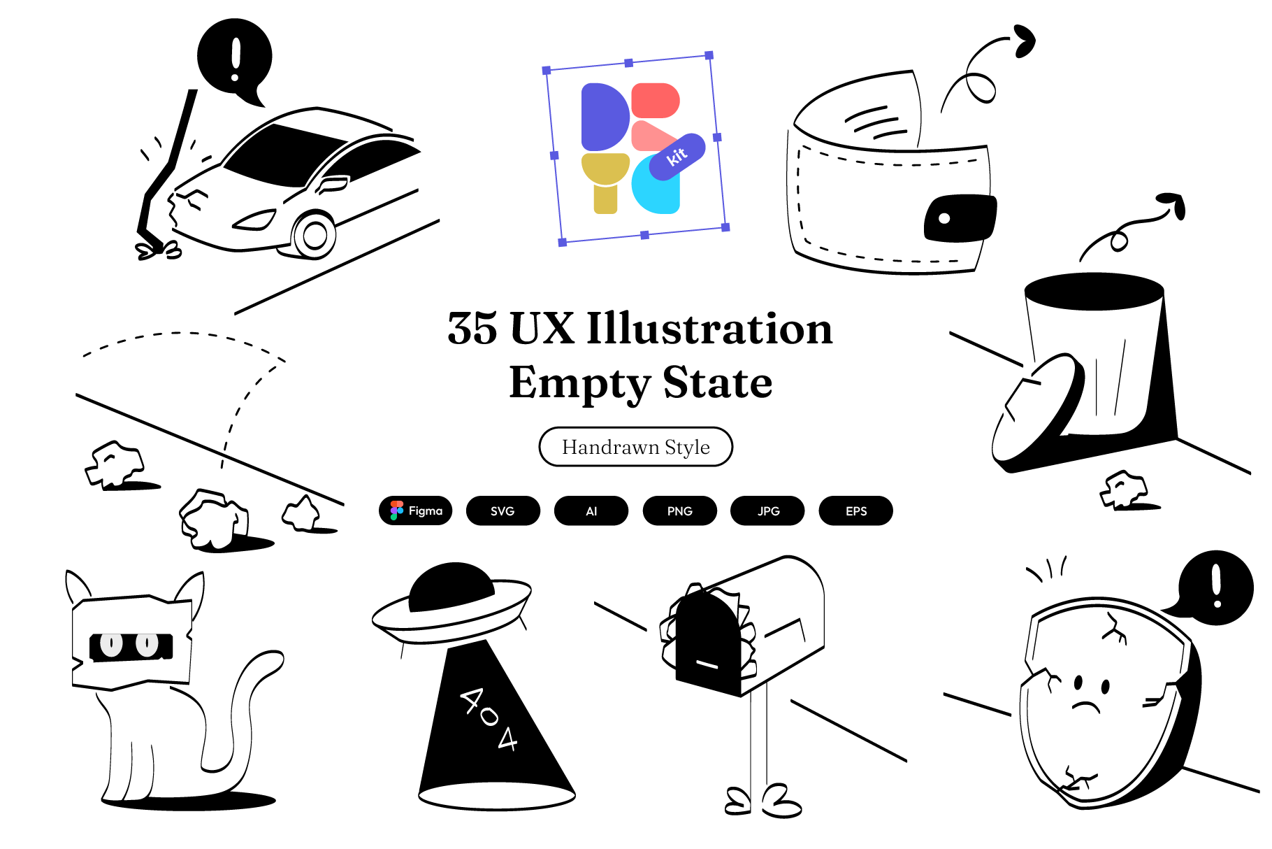
This set contains 35 hand-drawn outline illustrations. Its description explicitly covers no messages, no items and no results, making it a relevant source for “nothing yet” screens. Listed formats include Figma components, SVG, AI, PNG, EPS and JPG.
The outline treatment can sit beside short interface copy without requiring a large, image-led composition. Inspect the preview for a scene that matches your object or task, then adjust the color and size to your interface. The illustrations do not replace a usable create or import action.
No results: preserve the search and offer a way back
“No results for ‘annual report’” is more useful than an unexplained empty list. Keep the query visible, and, where supported, offer “Clear filters” or a way to edit the search. Someone should not need to re-enter all their work because no item matched the current combination.
Choose a small, calm illustration and give the corrective action more emphasis. A no-results state is not necessarily a first-use state: there may be plenty of data elsewhere in the account.
Subtle Empty States

Subtle Empty States is described as a UI placeholder solution with a clean, calming treatment. Its compatibility list includes Figma, PNG and SVG. It is worth comparing when you need a restrained illustration that leaves the search explanation and recovery controls prominent.
The listing does not specify an illustration count or an exhaustive list of scenarios. Use its previews to judge the visual fit, and confirm that the included files cover the state you intend to design. Do not choose it on an assumed number of scenes.
Errors: say what failed and what can happen next
An error screen needs an accurate explanation. For example, use “We couldn’t load your projects” and “Try again” only when retrying is actually supported. If the product retained unsaved work, say so; if you cannot establish that, do not invent reassurance to make the screen sound friendlier.
Avoid using the same wording for a network problem and an empty collection. Those conditions require different actions even if the same illustration style is used.
Empty State UI Illustrations

This pack’s description explicitly mentions error messages, service downtime and onboarding. It lists AI, EPS, Figma, JPG, SVG and PNG, including 512, 1024 and 2048 pixel PNG sizes. That makes it a relevant option to compare for interfaces with both informative and recovery states.
Choose the scene around the failure and the next available action. Keep the explanatory text separate from the illustration so it can be edited, translated and read independently. A visual treatment can support the message, but it cannot establish whether a retry, support link or offline workflow is available.
Keep one visual system across the states
Compare stroke weight, color, texture and the amount of detail at the size the illustration will actually occupy. A consistent family is easier to apply across a product than unrelated images chosen one screen at a time. Check the illustration beside both a one-line message and a longer explanation so the composition can handle real content.
Before shipping, review each state with its heading, supporting text and action visible together. Make sure the meaning remains clear without the image. Treat artwork as decorative when it adds no information beyond the text, and avoid baking essential instructions into a raster image.
For more visual directions, browse illustration packs. For choosing a broader visual style, see website illustration styles and examples.
Read more
Explore all